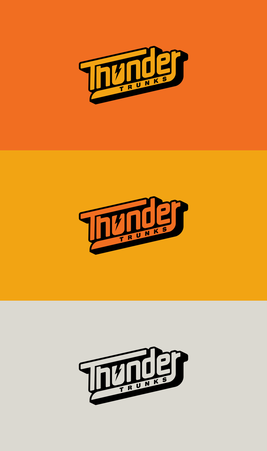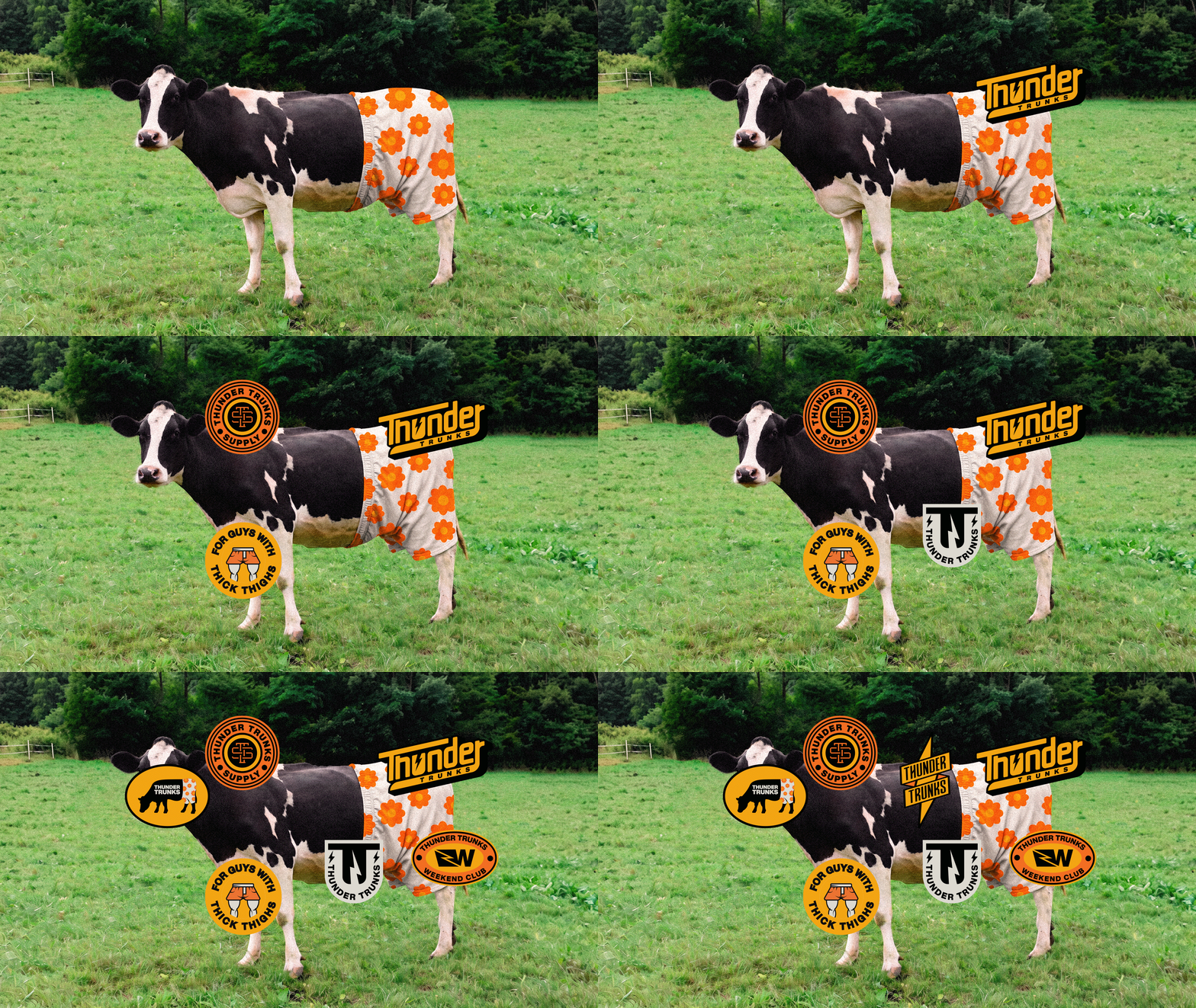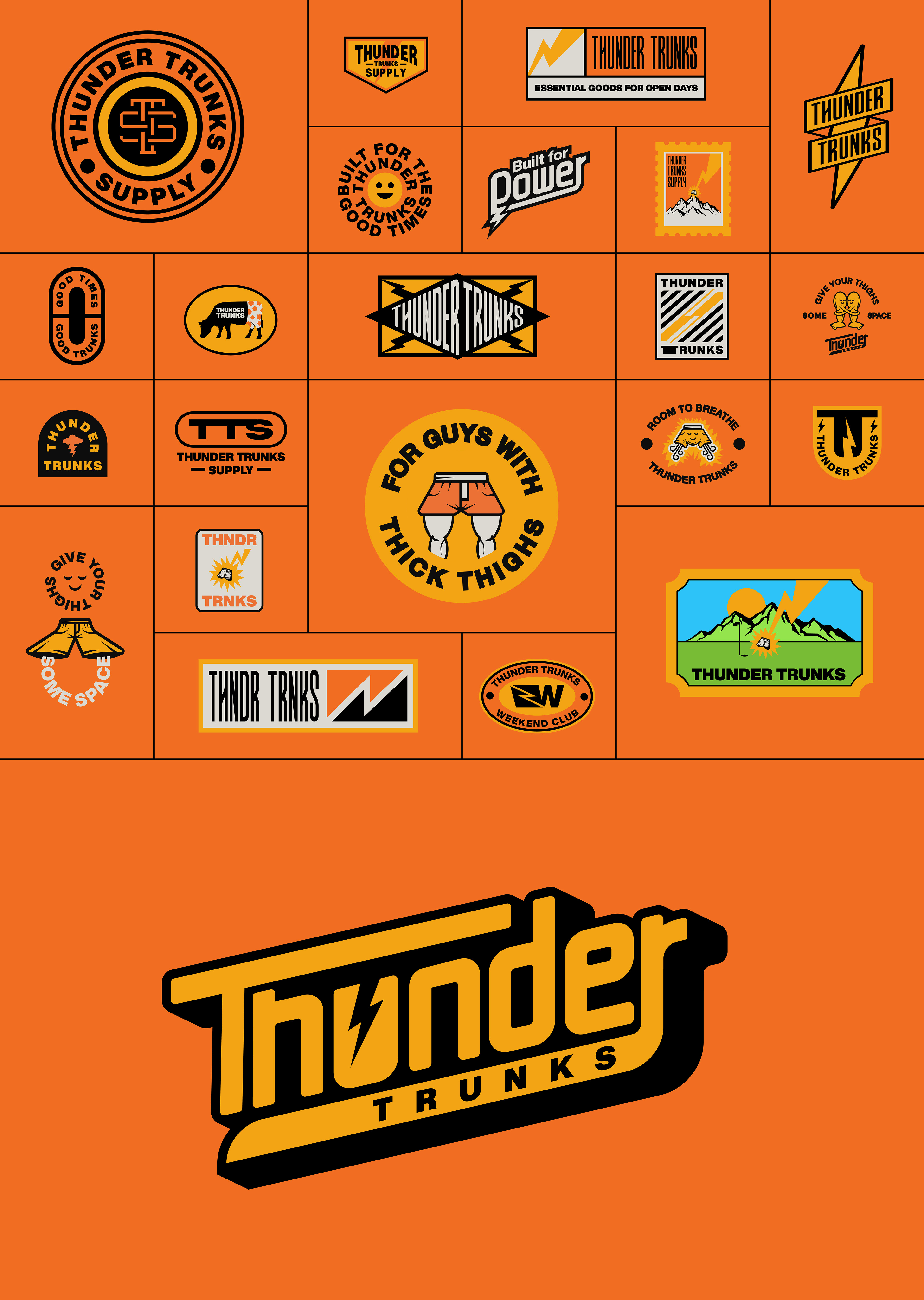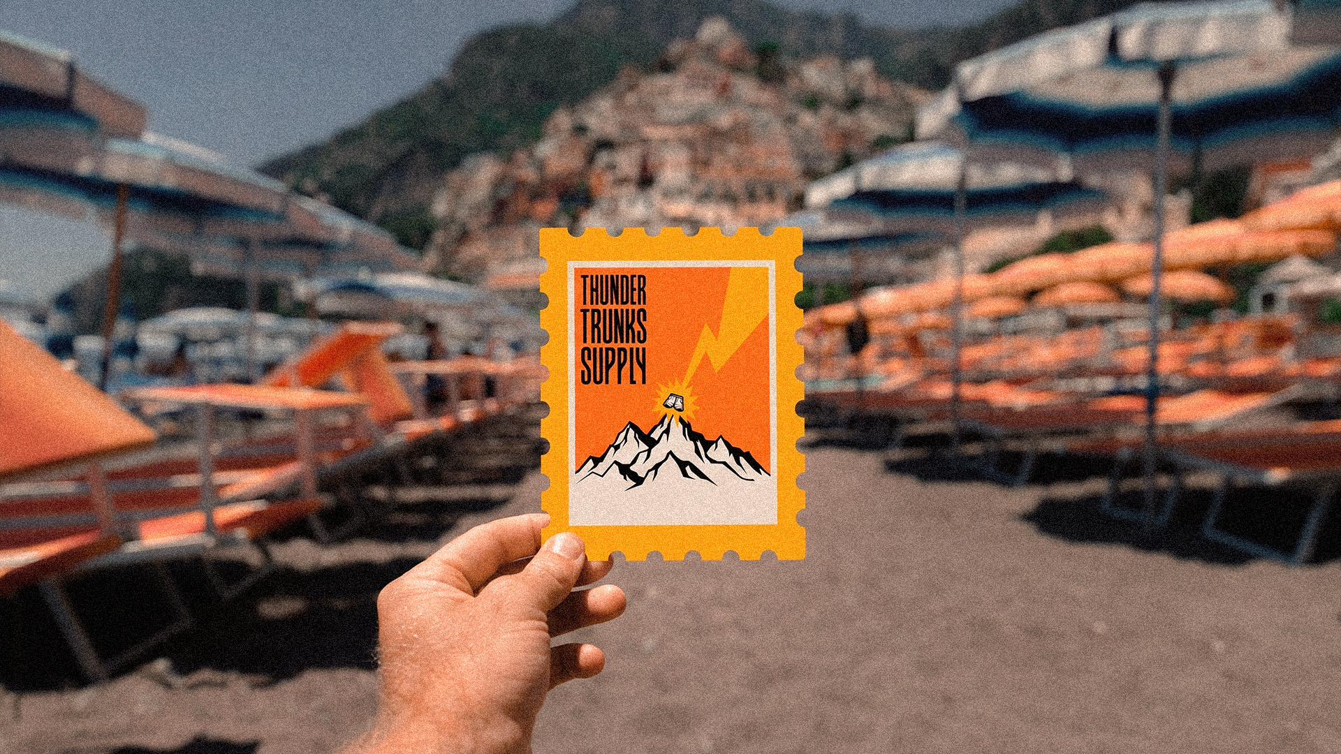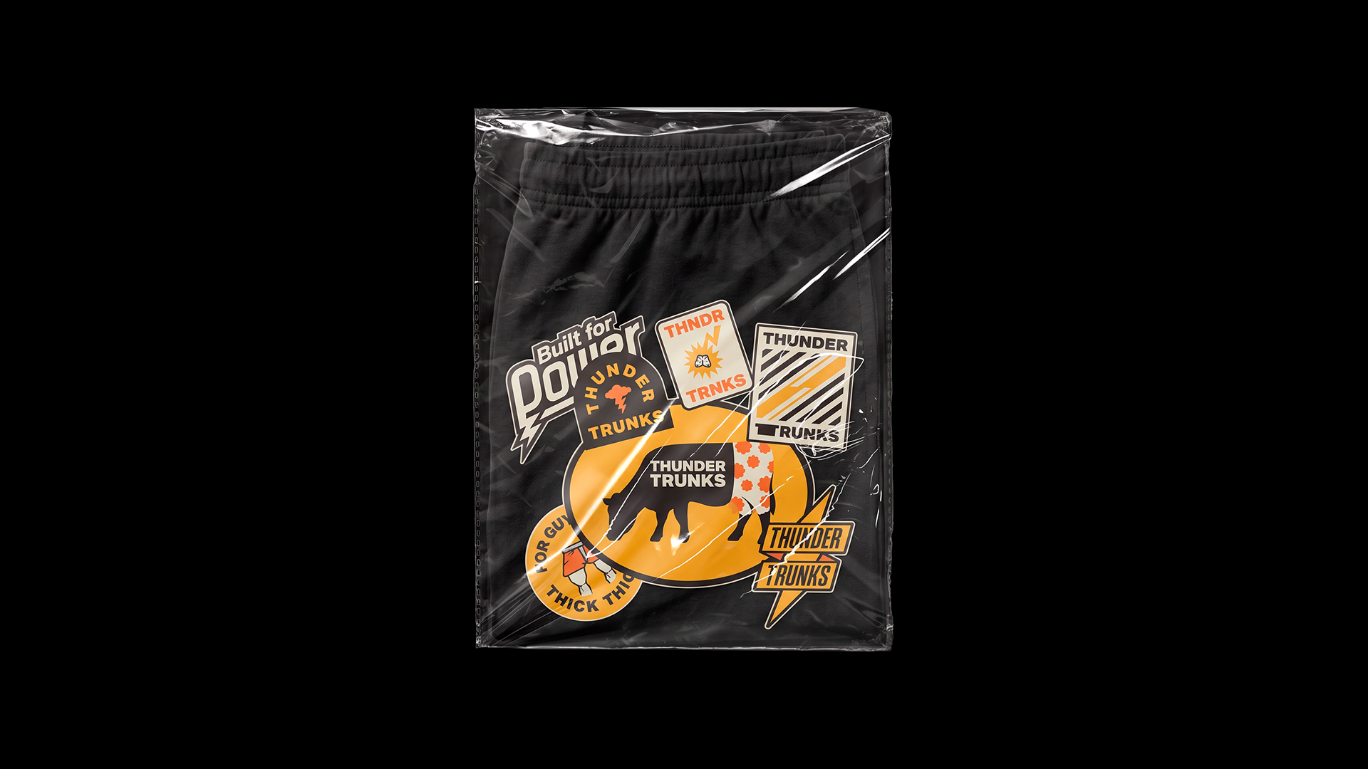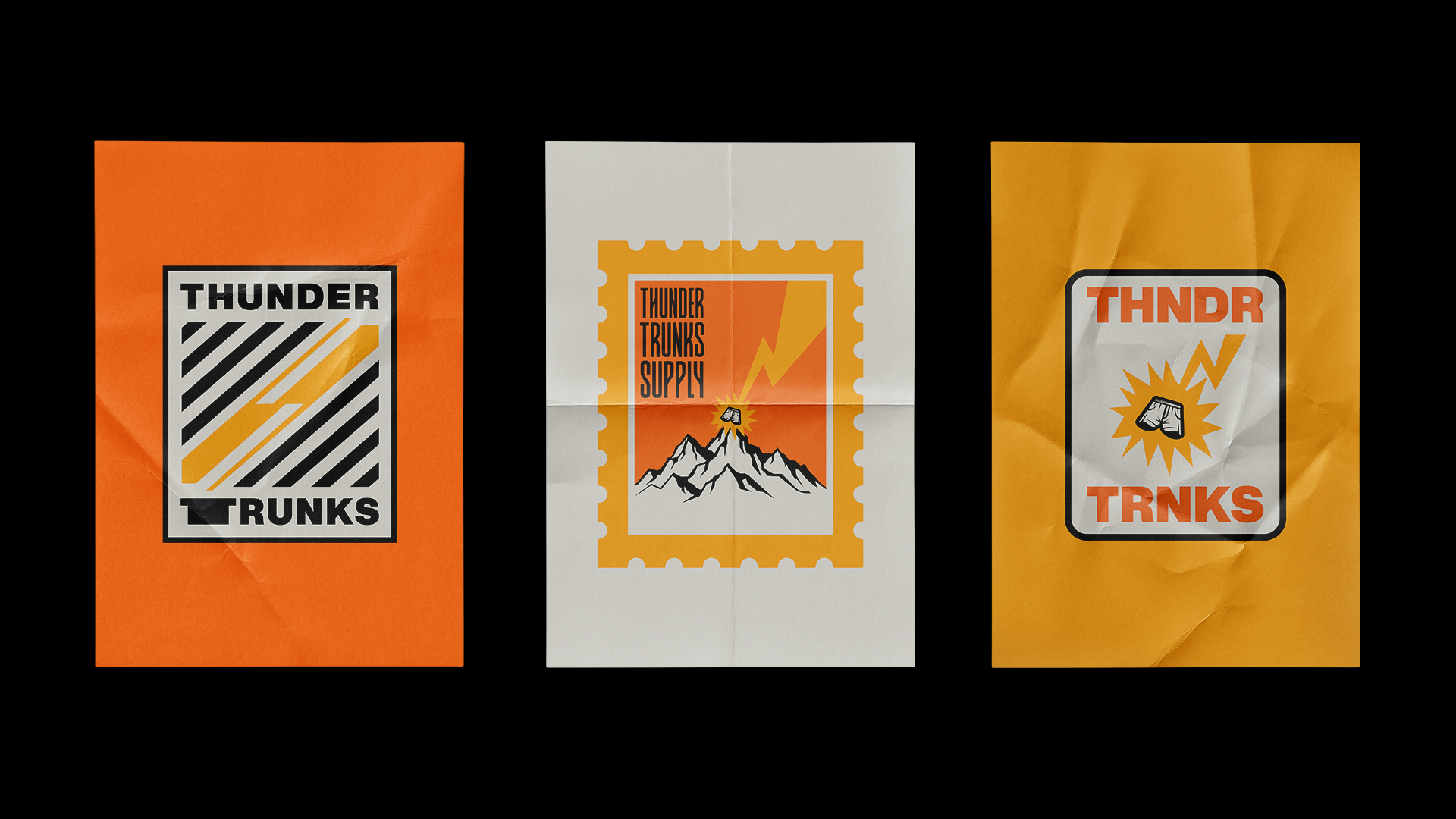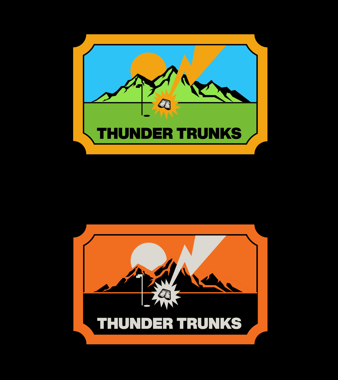
Thunder Trunks — Brand Identity
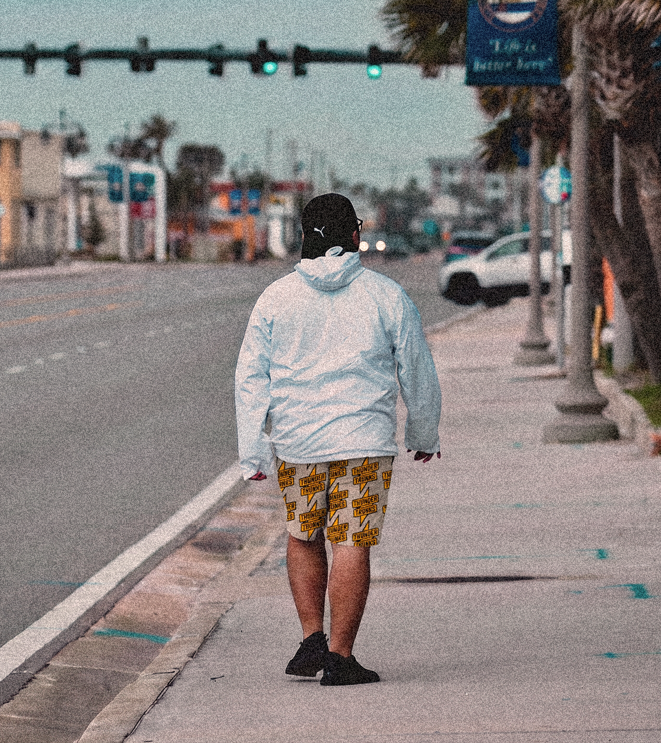
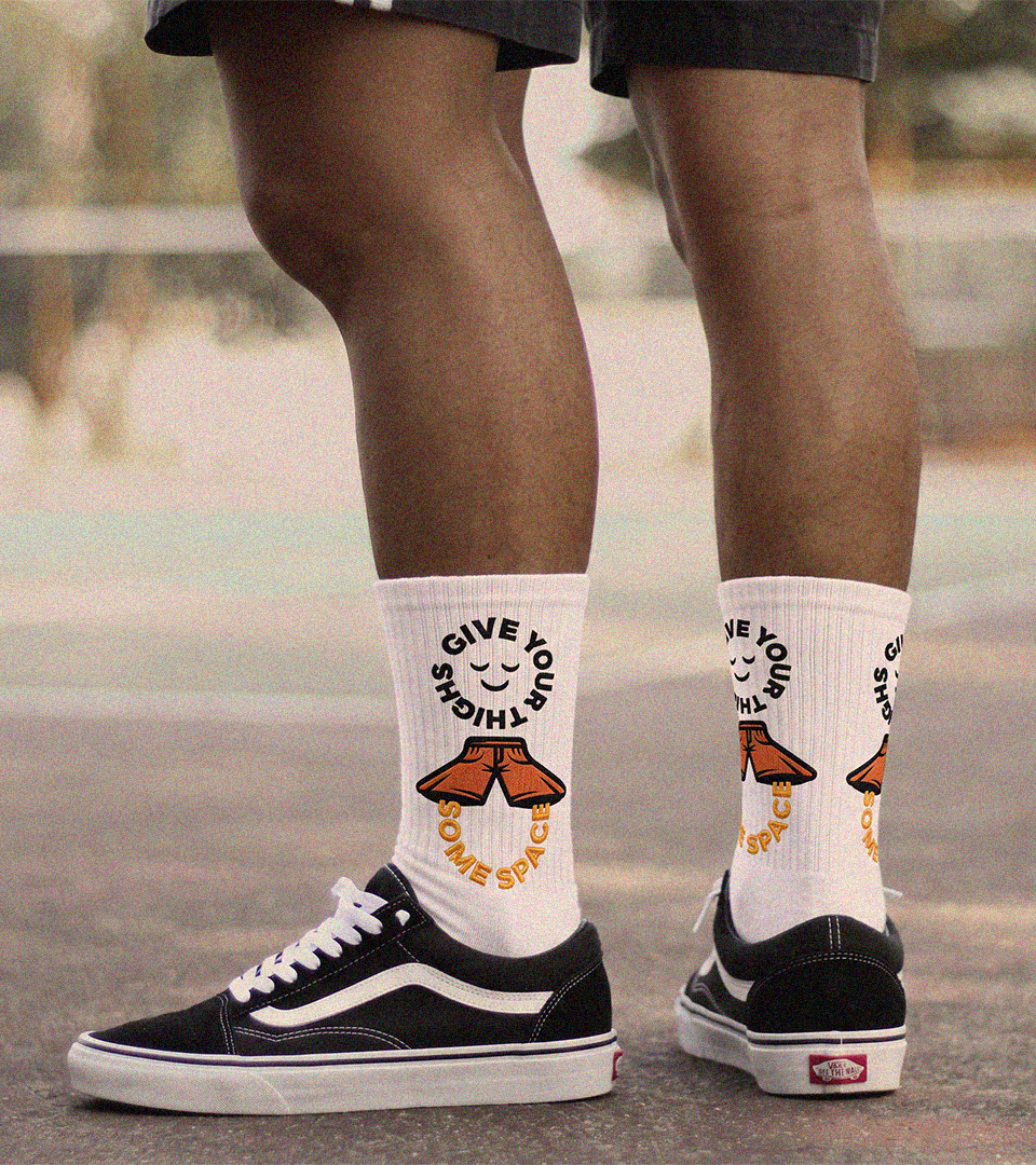
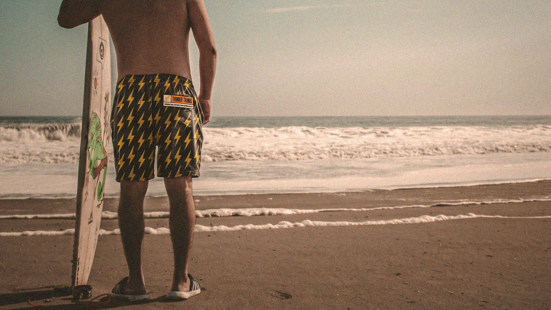
Thunder Trunks started with a simple problem: finding shorts that actually fit guys with bigger, athletic thighs without having to size up at the waist. The brand was created around that frustration and turned it into something confident
playful and genuinely useful.
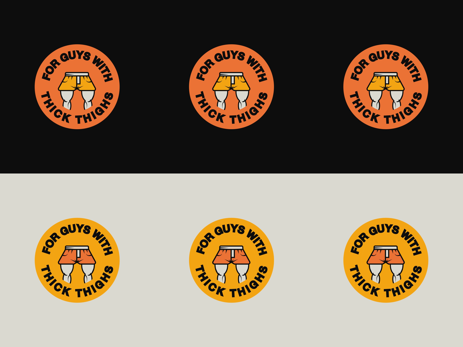
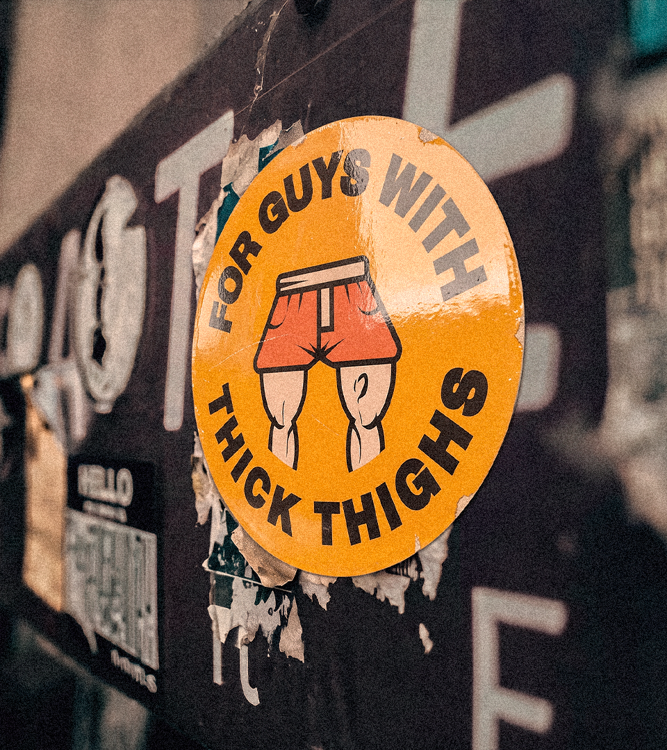
“For the guys with thick thighs.”
The identity needed to feel masculine and energetic, but never too aggressive or overly sporty. The goal was to build a visual world that could live naturally across golf, gym, swim and everyday wear, while keeping enough personality to make
the brand instantly recognizable.
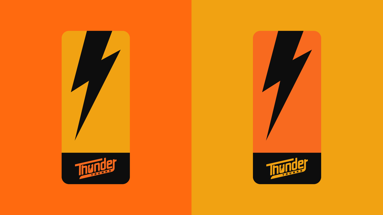
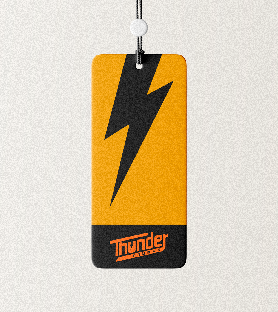
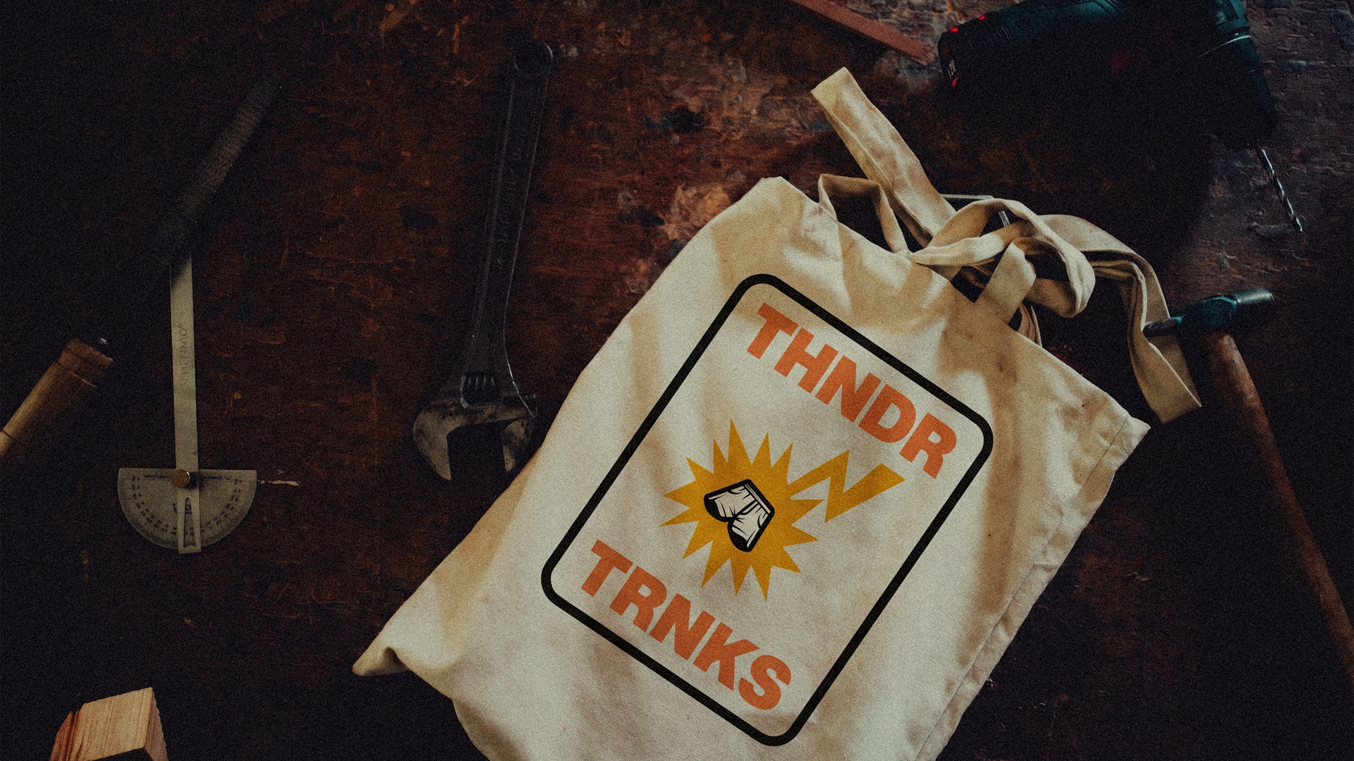
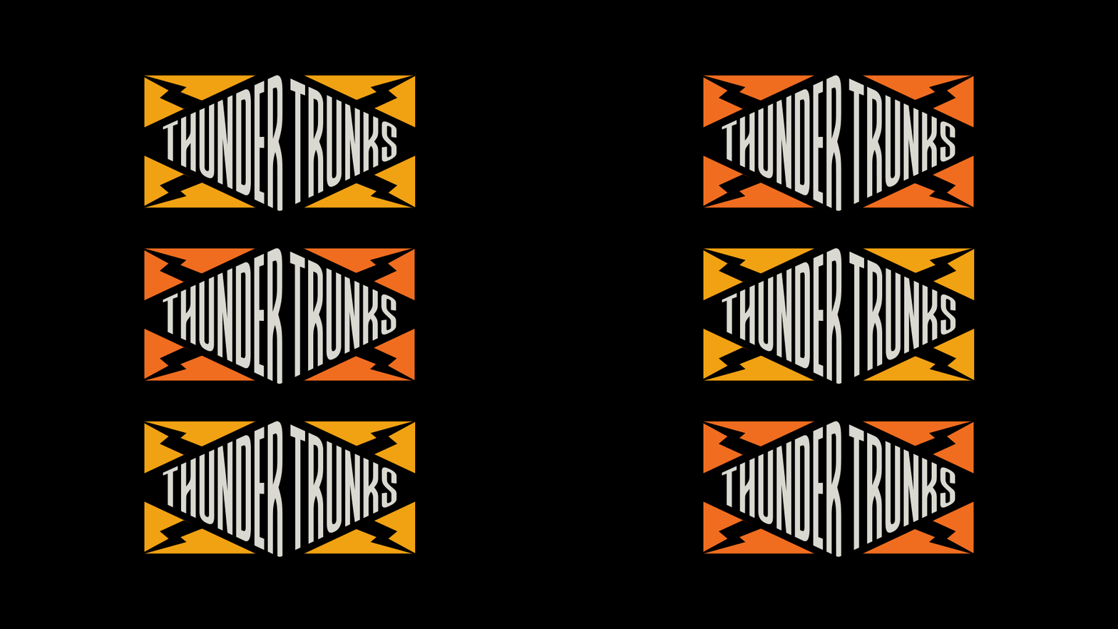
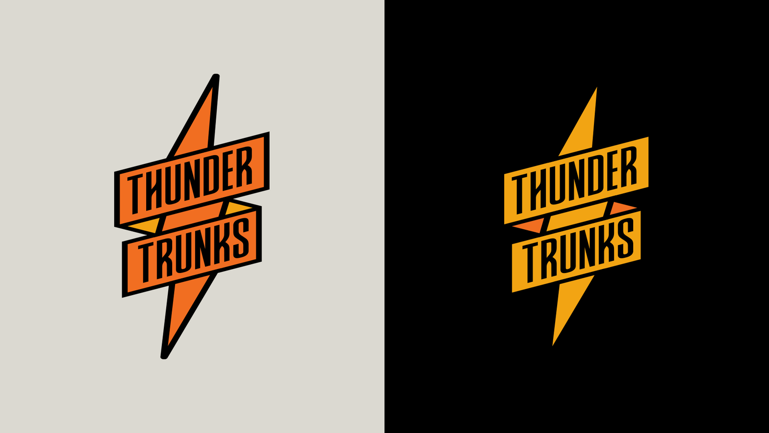
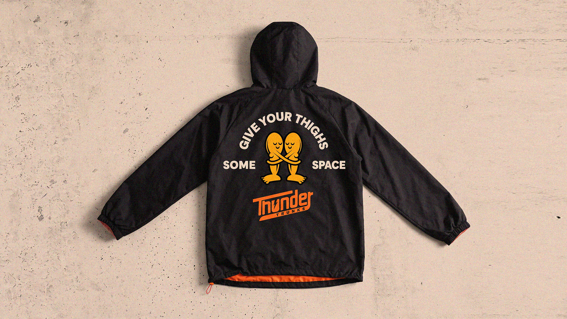
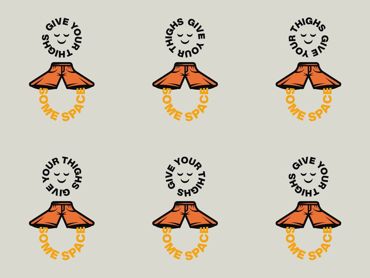
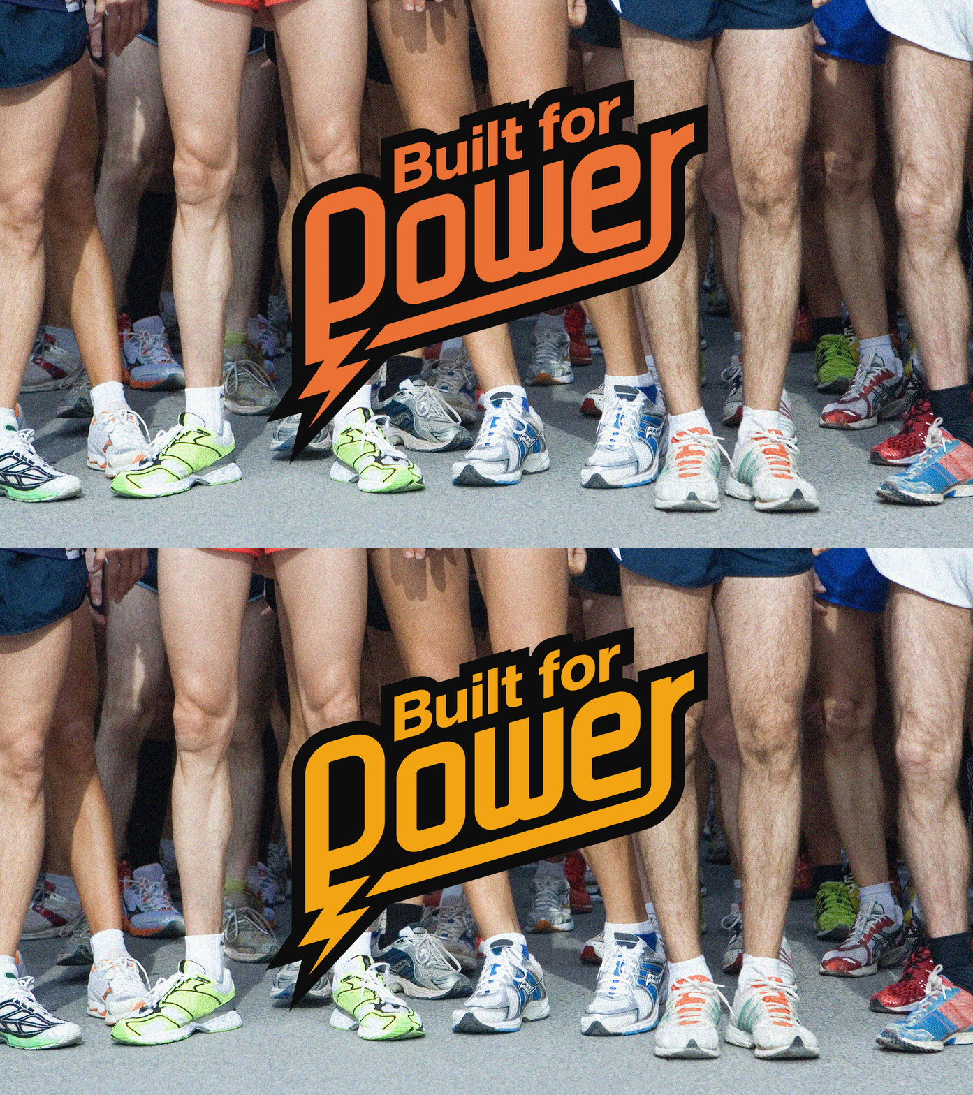
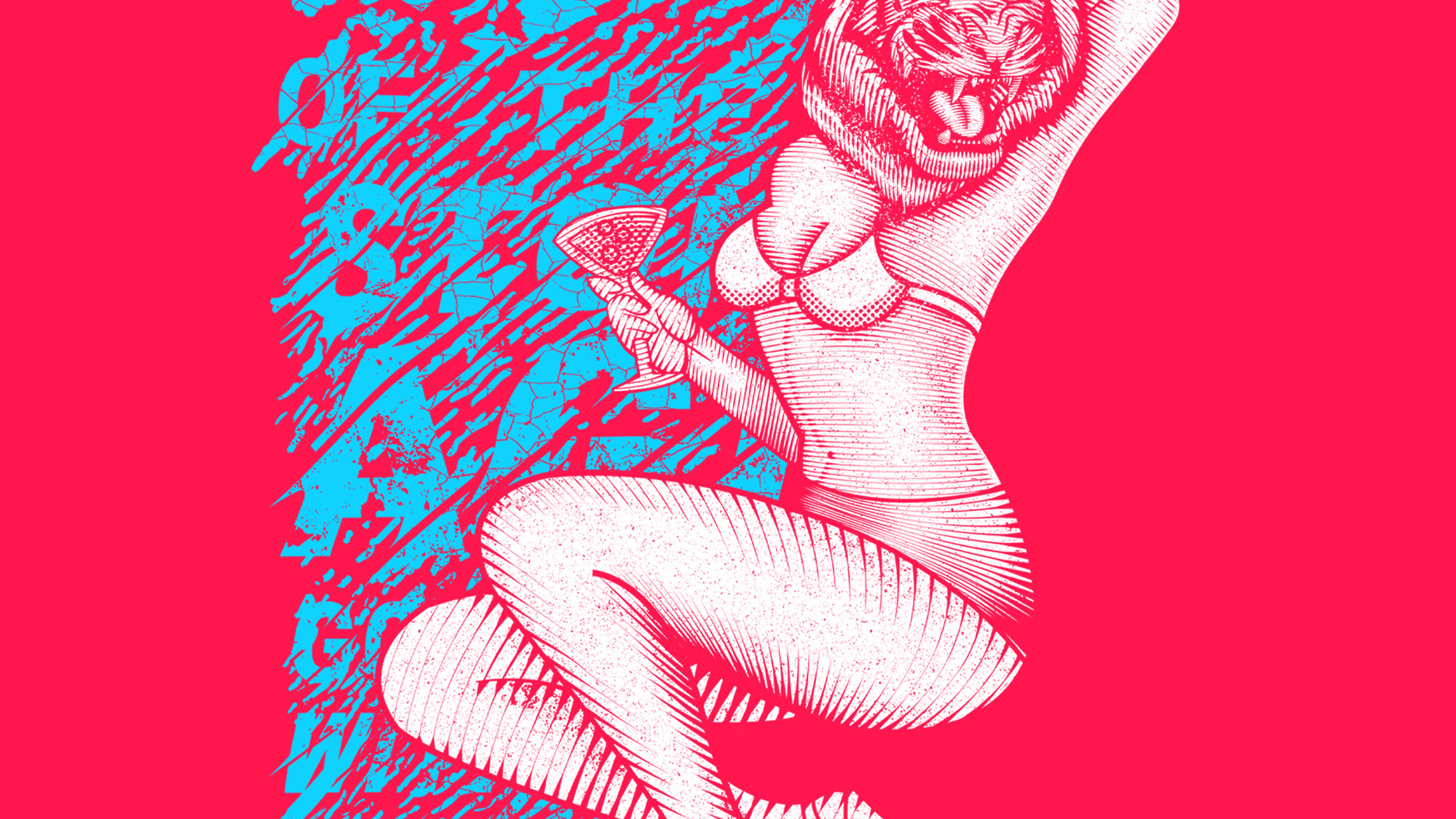
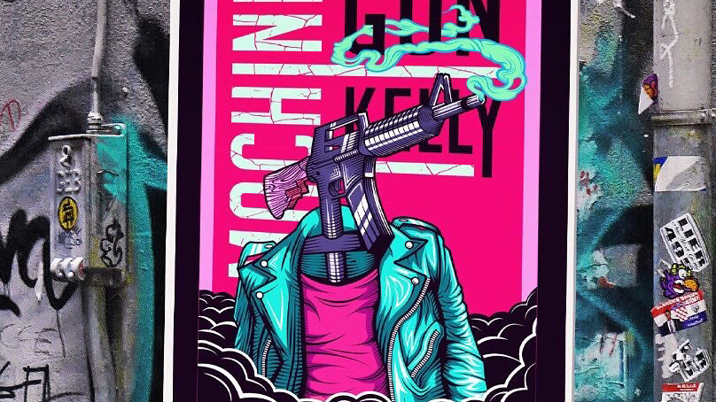
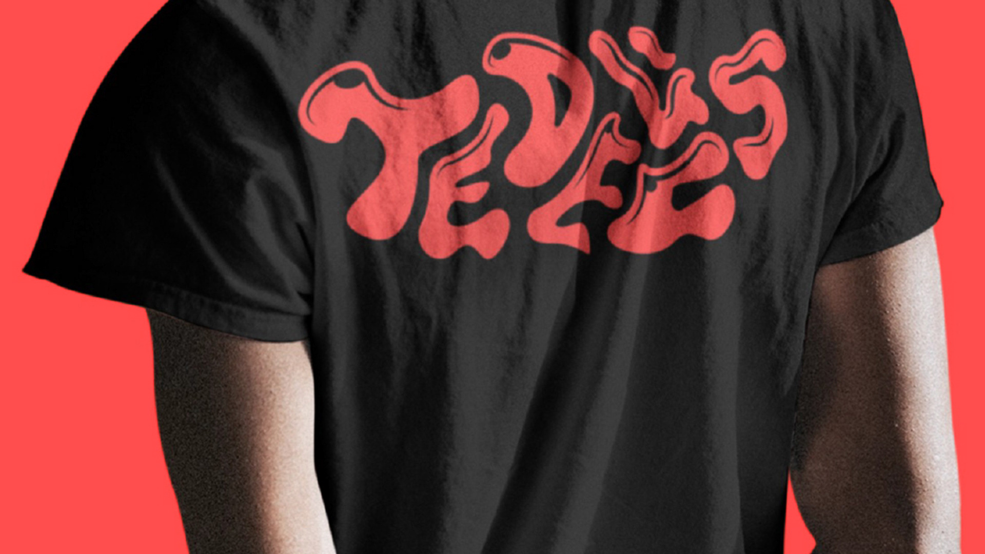
Instead of leaning into obvious fitness clichés, the system was built around bold typography, a confident graphic language and a playful attitude. Thunder Trunks is designed for men who care about fit, quality and looking good without
taking themselves too seriously.
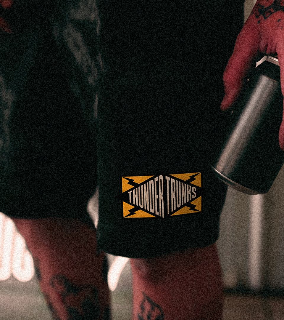
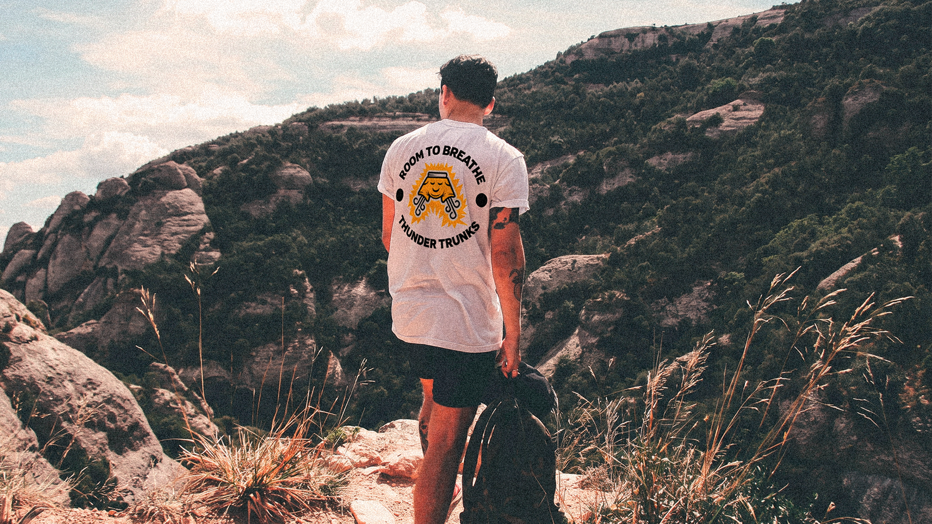
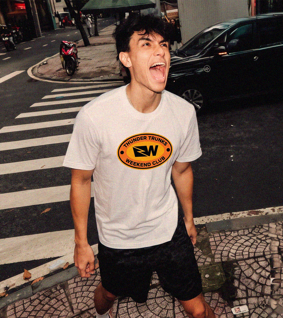
The result is a brand that feels strong, approachable and flexible enough to grow across apparel, packaging, campaigns and digital applications.
Client: Thunder Trunks
Country: USA
Year:2025