La Pasta
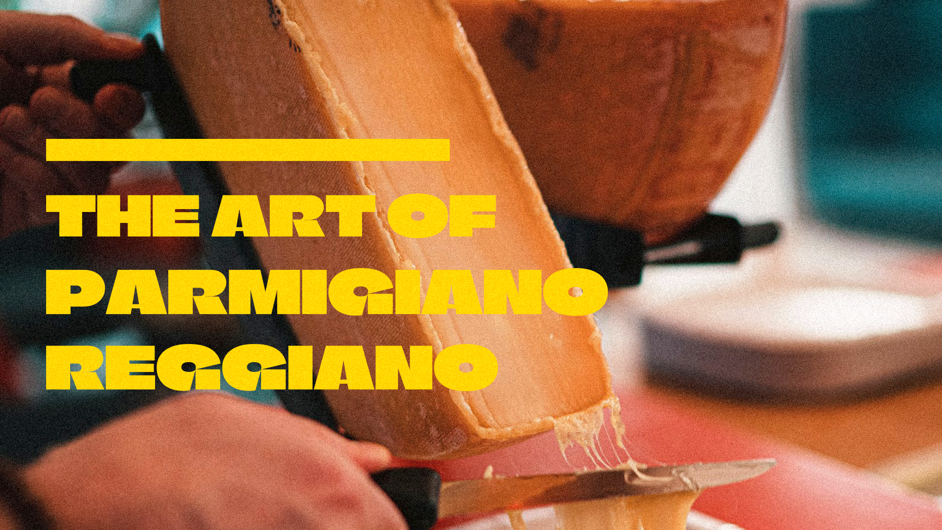
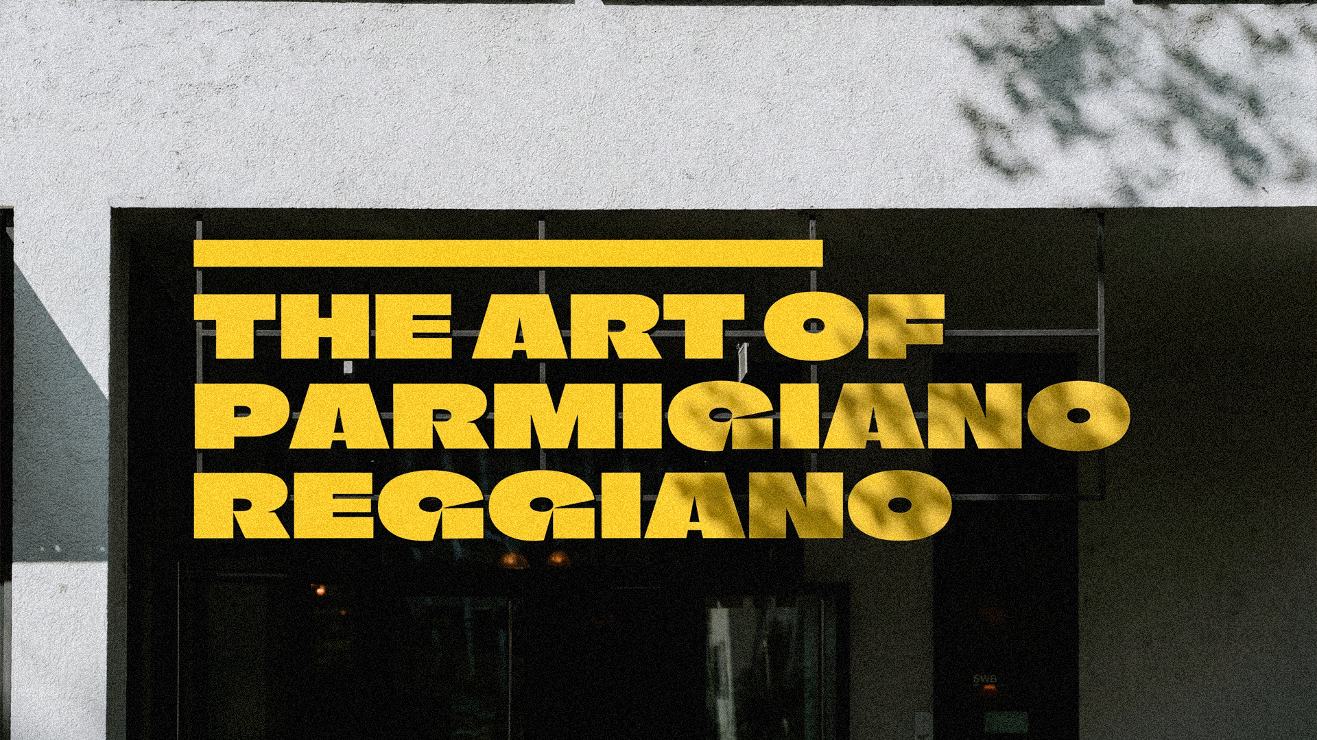
La Pasta is a fresh Italian pasta concept created around the warmth, craft, and ritual of handmade food. Built from scratch and finished in a wheel of Parmigiano-Reggiano, the brand celebrates pasta as an experience — generous, expressive, familiar, and full of movement.
The identity is rooted in the visual language of classic Italian dining, but reinterpreted through a softer and more contemporary lens. Elegant curves, organic forms, delicate details, and a warm feminine personality shape a brand that feels sophisticated without becoming distant, and accessible without losing its sense of quality.
Rather than approaching pasta only as a product, the visual system explores it as a symbol of tradition, gesture, and shared moments. The design direction combines classic refinement with modern warmth, creating a restaurant identity that can feel equally natural in a casual lunch, a family dinner, or a memorable food experience inside a busy commercial space.
Designed for families, students, and everyday shoppers, La Pasta brings the craft of Italian cuisine into a fresh and approachable environment — balancing authenticity, comfort, and a polished visual presence.
Client: La Pasta
Country: USA
Year: 2026
Scope: Brand Identity, Visual System, Art Direction
Country: USA
Year: 2026
Scope: Brand Identity, Visual System, Art Direction

Challenge
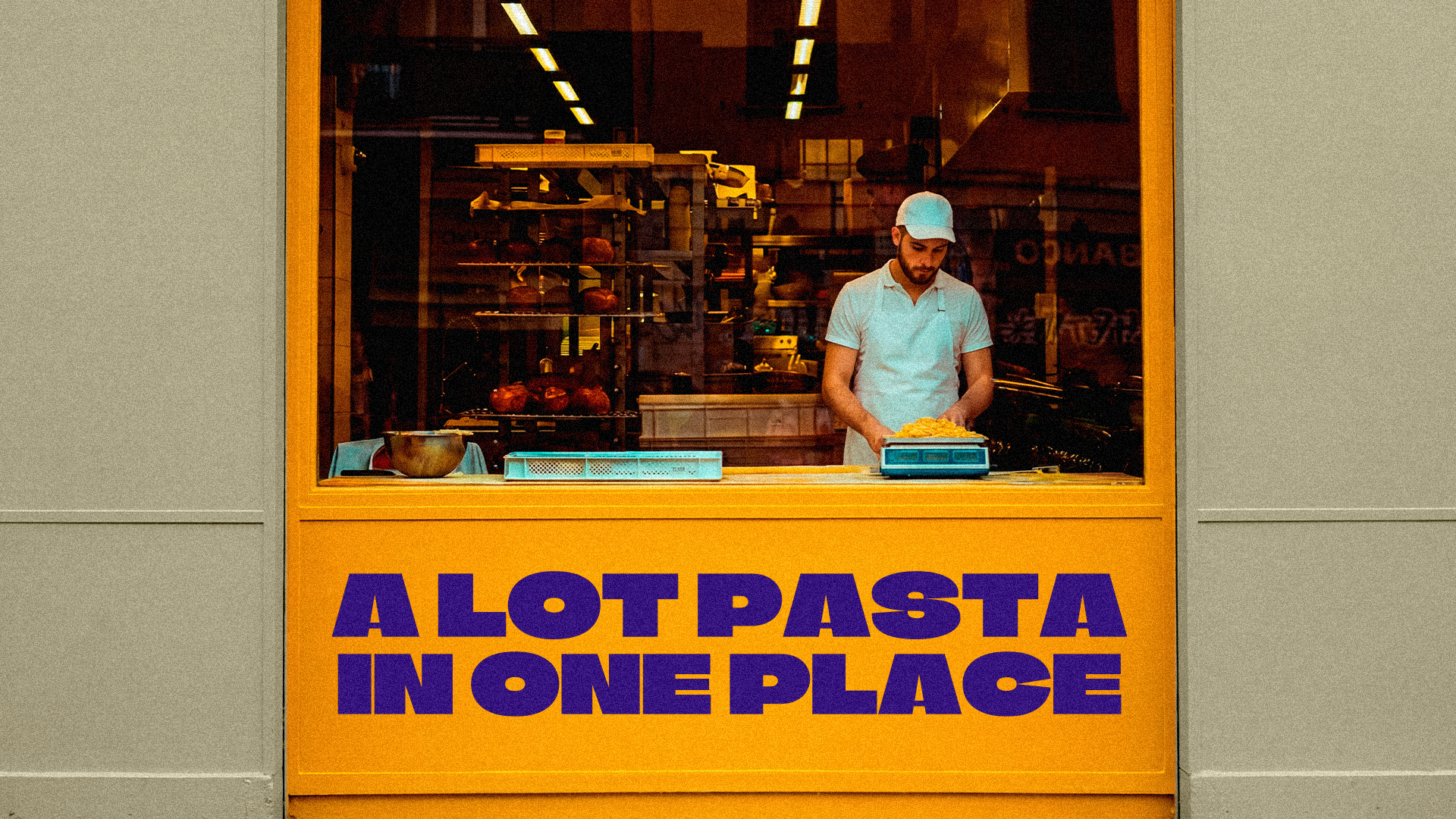
The challenge was to create a brand identity for a fresh pasta restaurant that could feel authentic, energetic, and easy to recognize in a busy food environment. La Pasta needed to communicate the craft of handmade Italian pasta while staying approachable for families, students, and everyday shoppers.
The challenge was to create a brand identity for a fresh pasta restaurant that could feel authentic, energetic, and easy to recognize in a busy food environment. La Pasta needed to communicate the craft of handmade Italian pasta while staying approachable for families, students, and everyday shoppers.
The identity also had to avoid feeling generic or overly traditional. The goal was to build a visual language with warmth, flavor, and personality, while connecting the brand to Italian culture in a way that felt fresh, bold, and memorable.
Solution
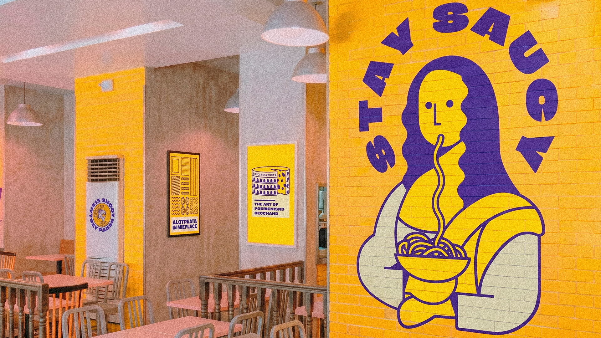
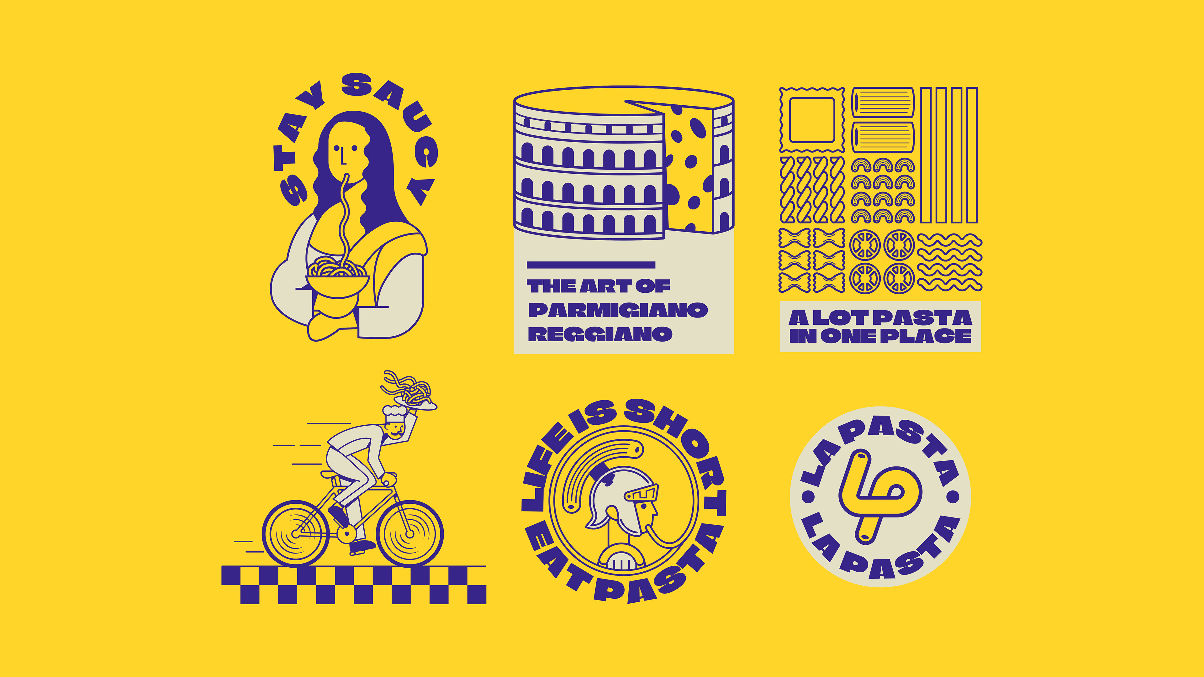
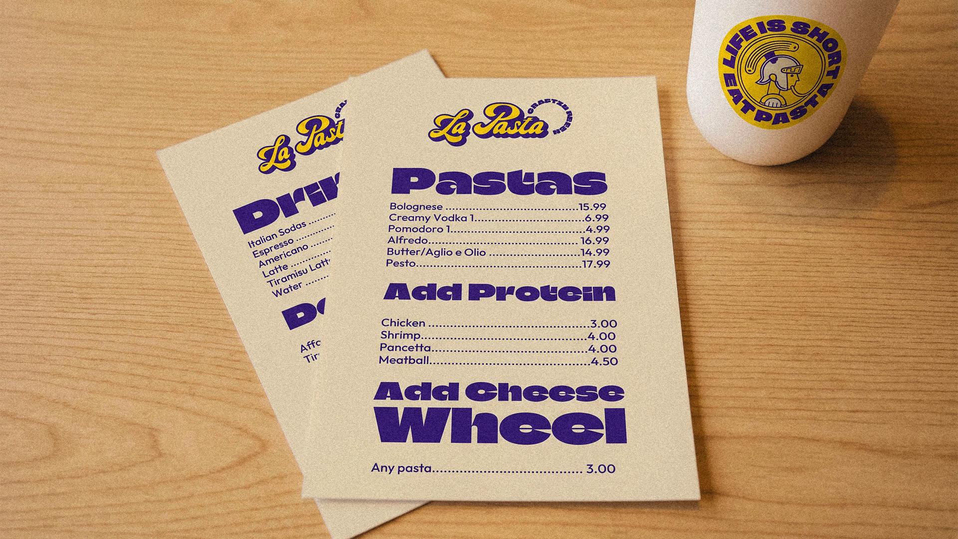
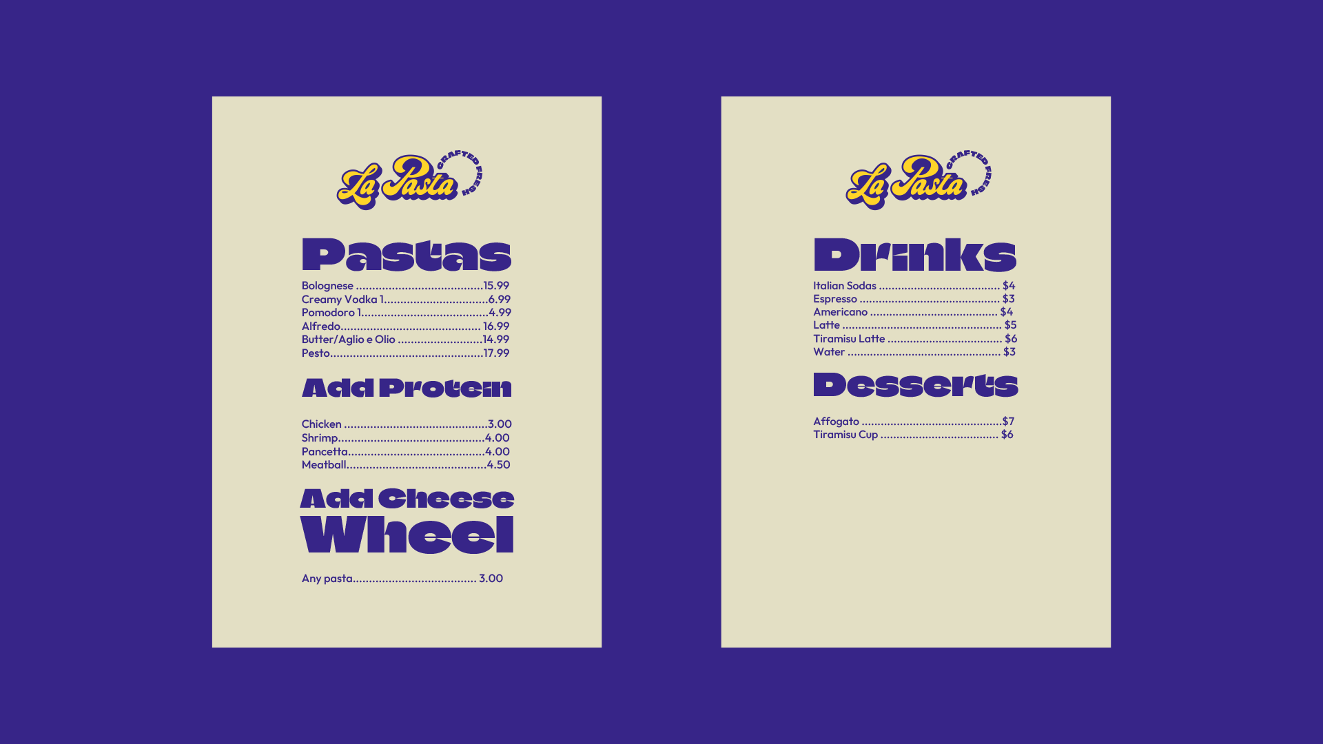
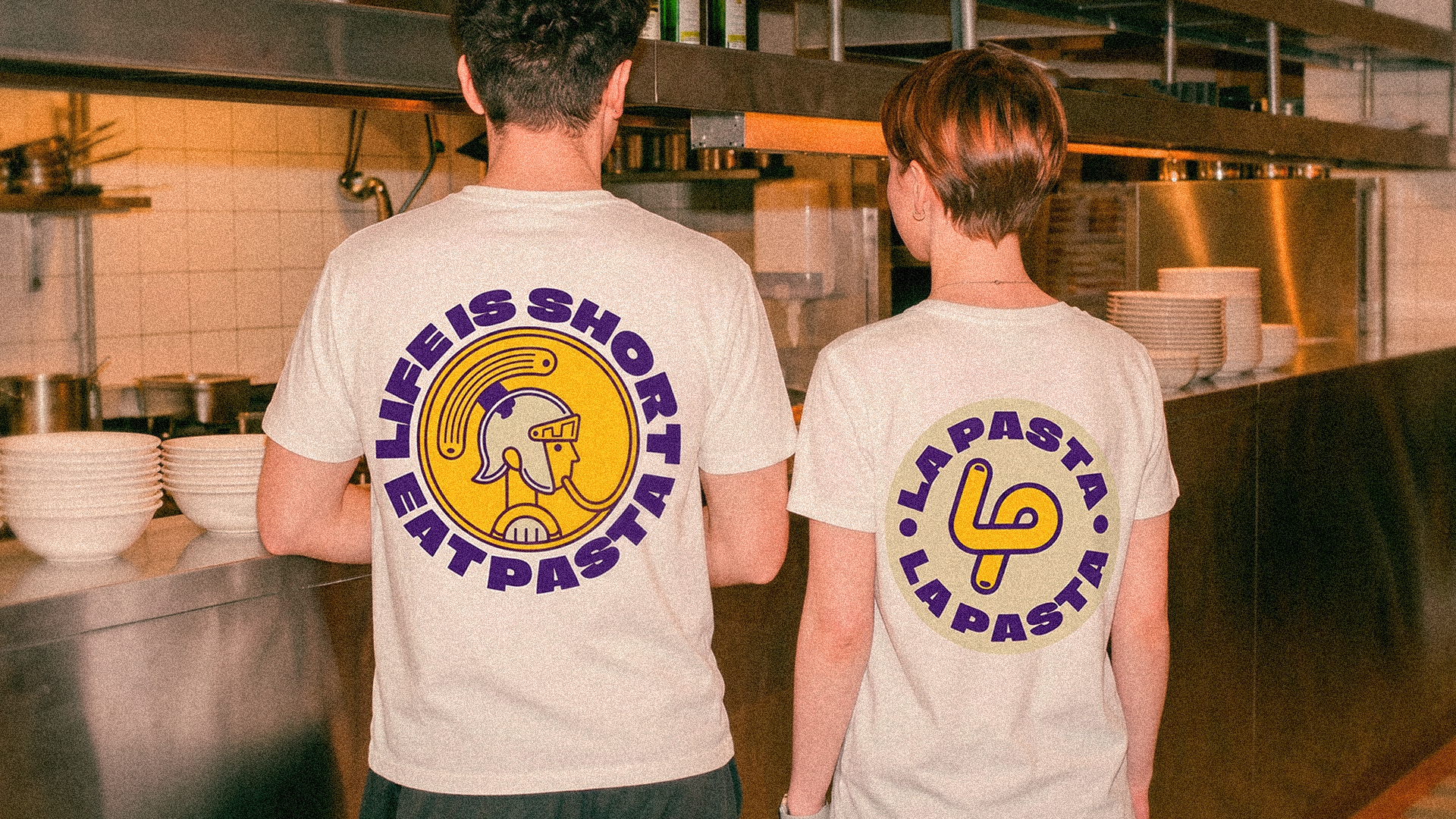
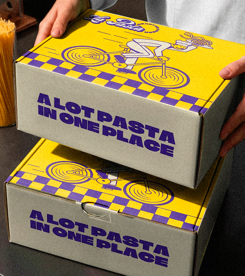
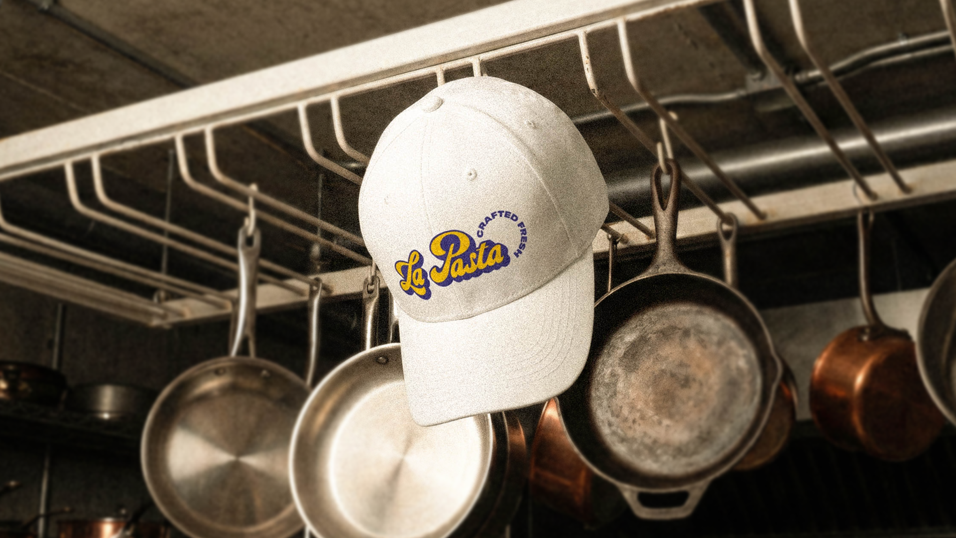
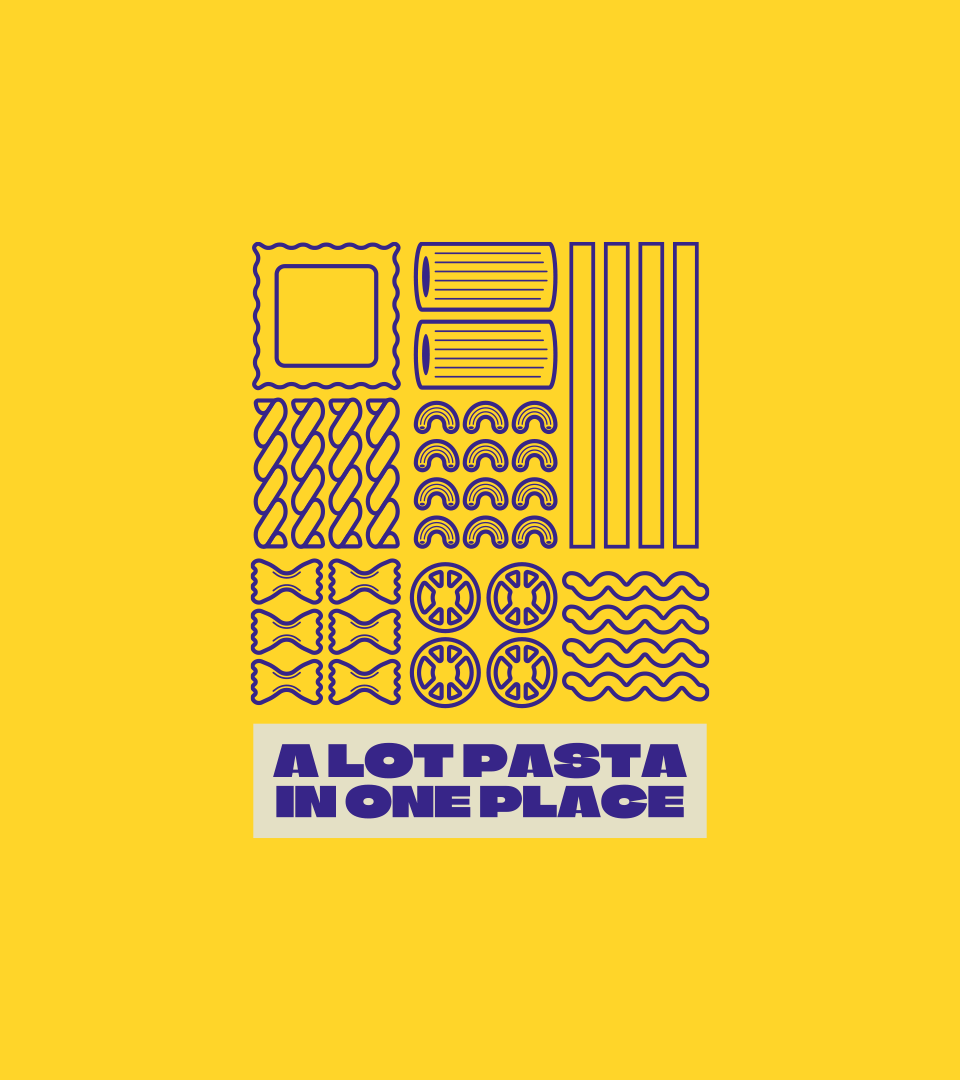
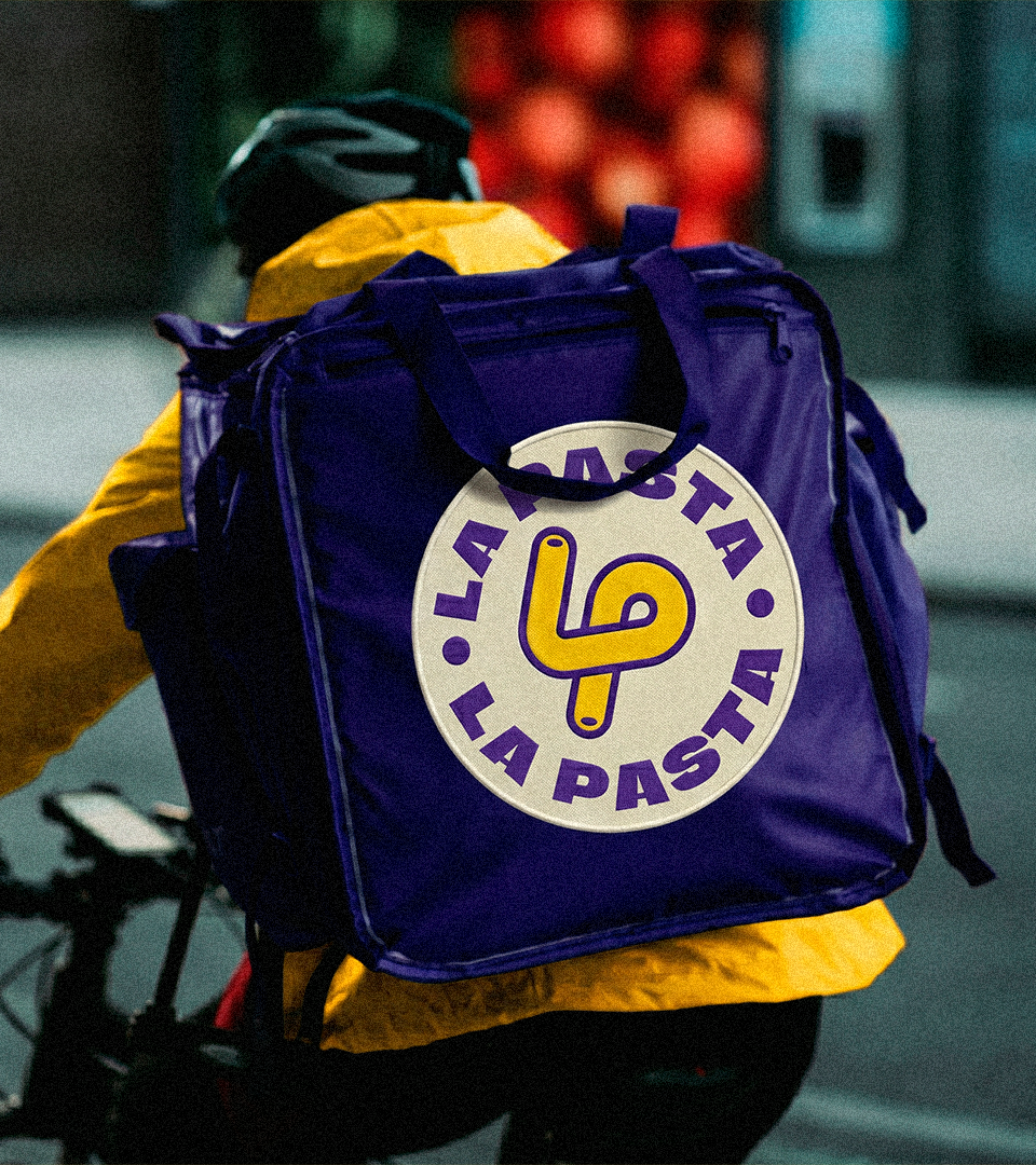
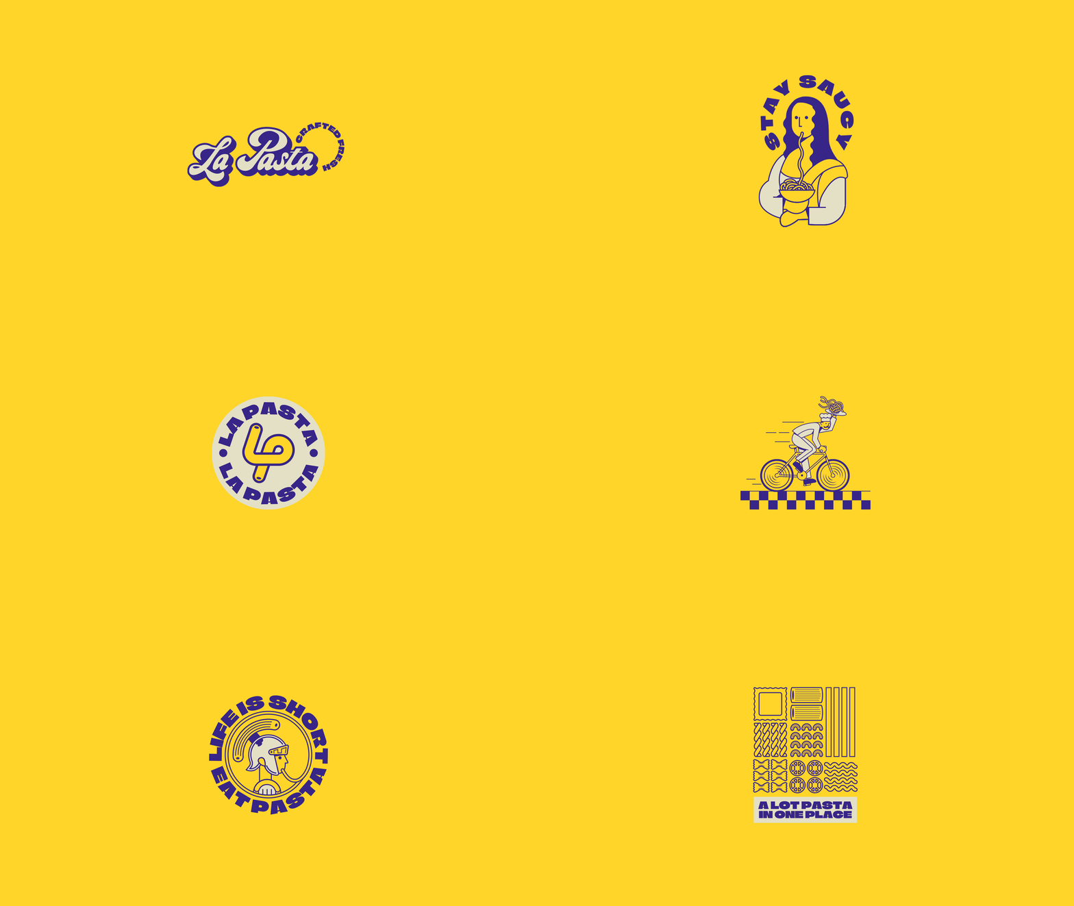
The solution was to create a bold and expressive identity inspired by the movement, generosity, and joy of fresh pasta. The visual system combines a vibrant blue and yellow palette, warm cream backgrounds, classic script lettering, graphic stamps, and playful compositions that bring energy to the brand without losing its handmade Italian character.
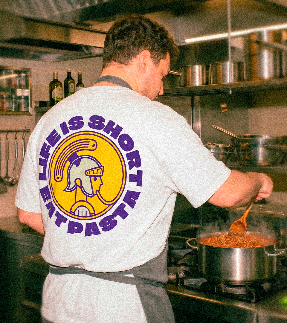
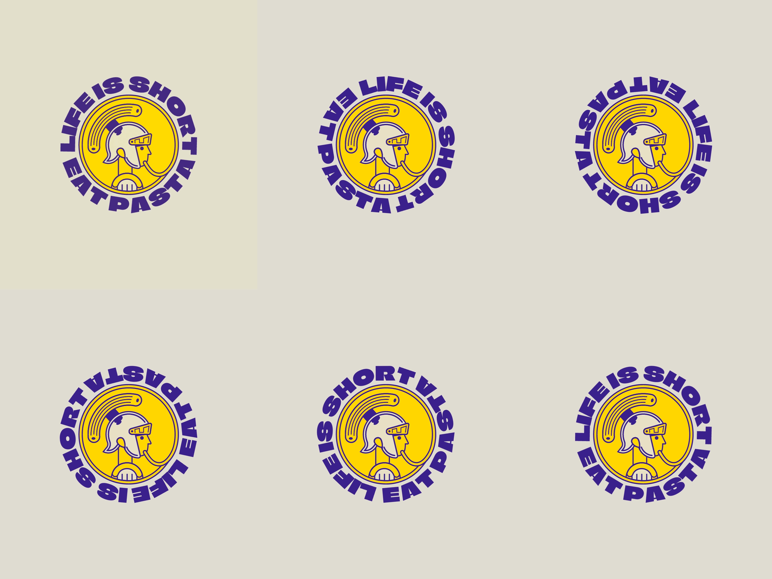
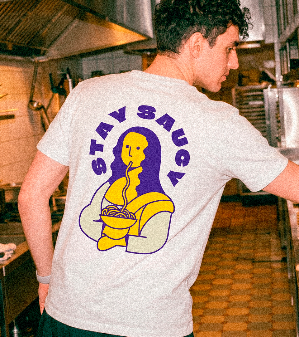
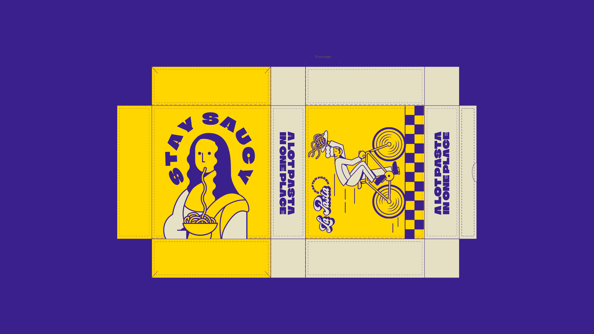
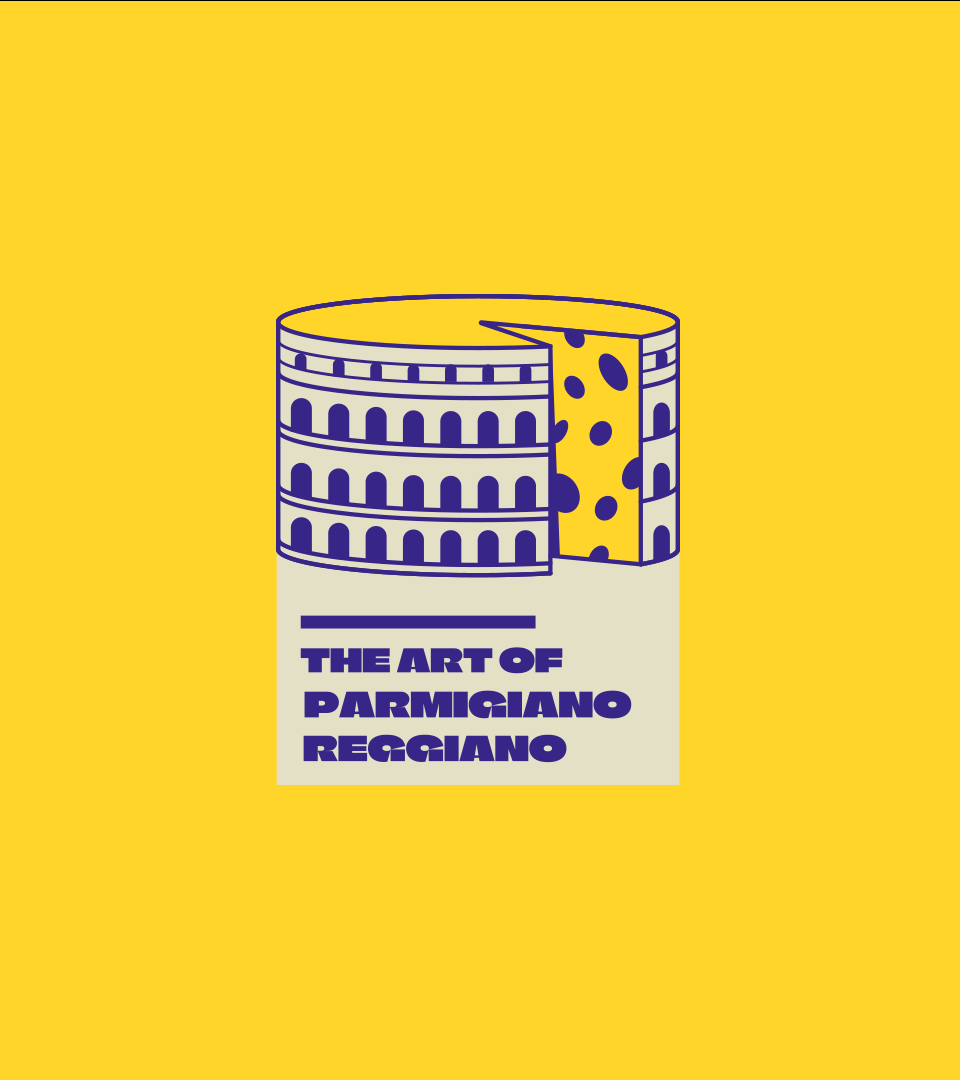
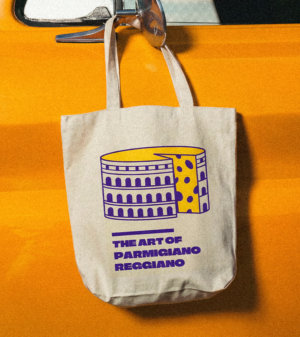
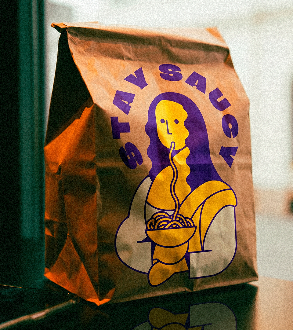
To give the identity a stronger cultural foundation, the visual language incorporates references to iconic elements of Italian heritage, such as Roman-inspired details, the Praetorian figure, the Colosseum, and La Gioconda, also known as the Mona Lisa. These references were not used in a literal or decorative way, but reinterpreted as graphic symbols that add history, character, and a sense of place to the brand.
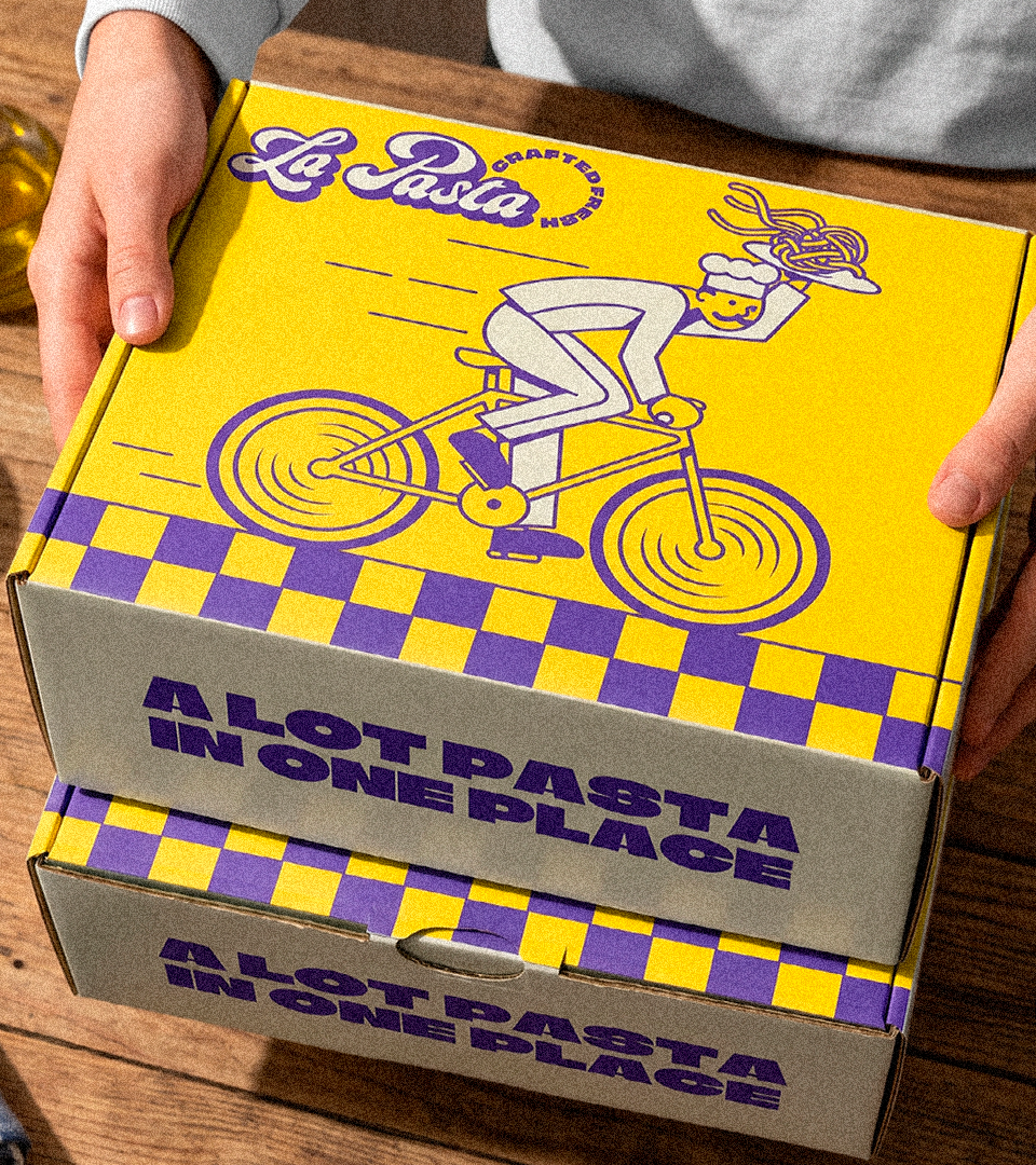
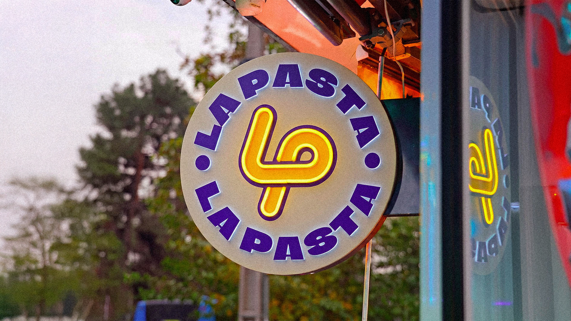
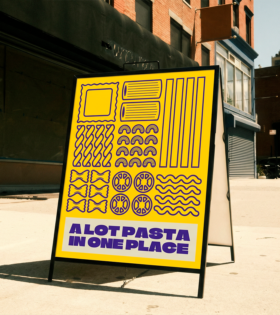
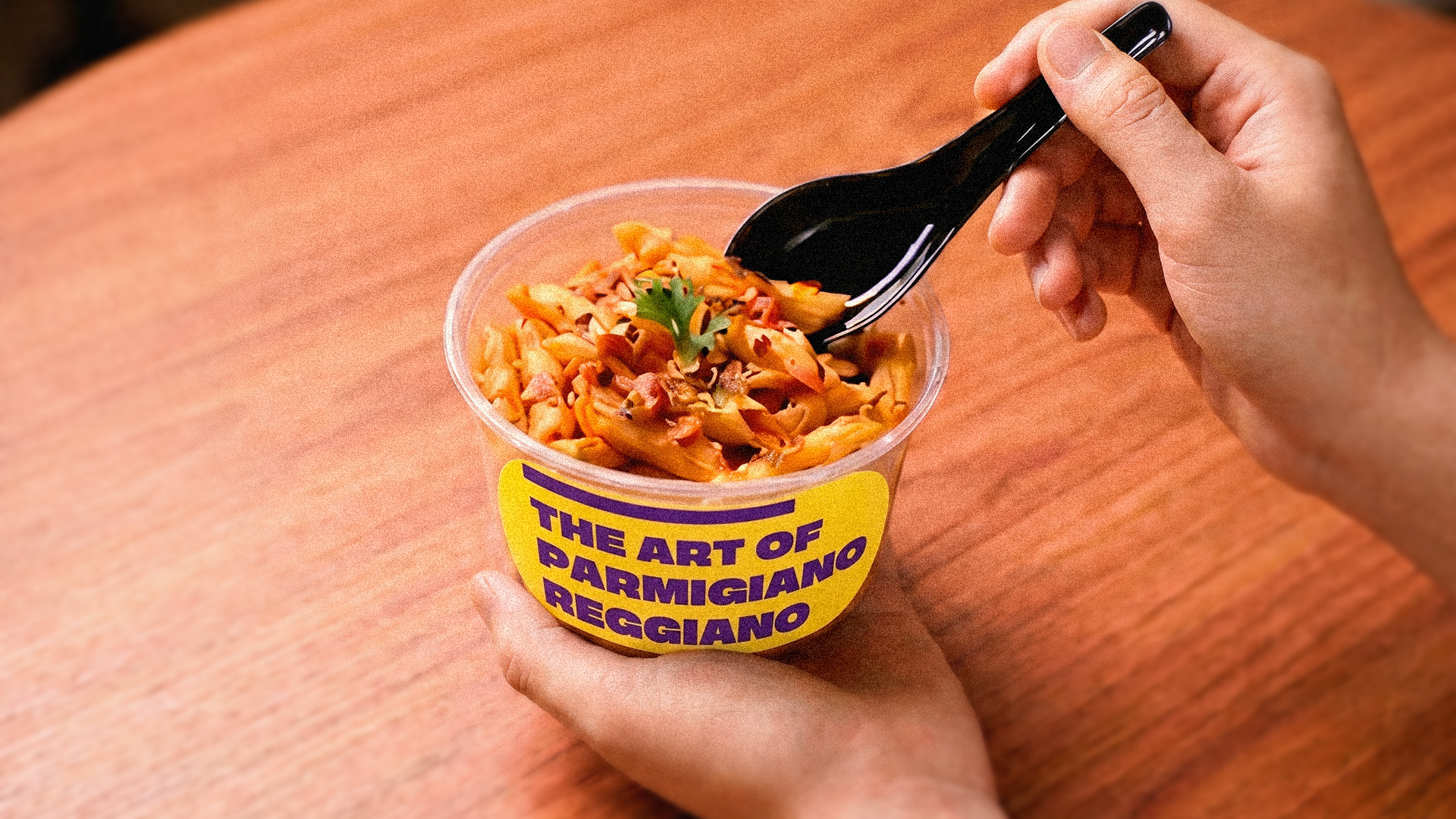
The result is a restaurant identity that feels crafted, familiar, and full of flavor. From the logo and typography to the illustrations, stamps, patterns, packaging, and digital applications, La Pasta was designed to feel instantly recognizable, warm, and commercially strong across every touchpoint.



Thanks for watching and appreciating.
___________________________
Studio Vandal Co.
Branding l Illustration